Textarea
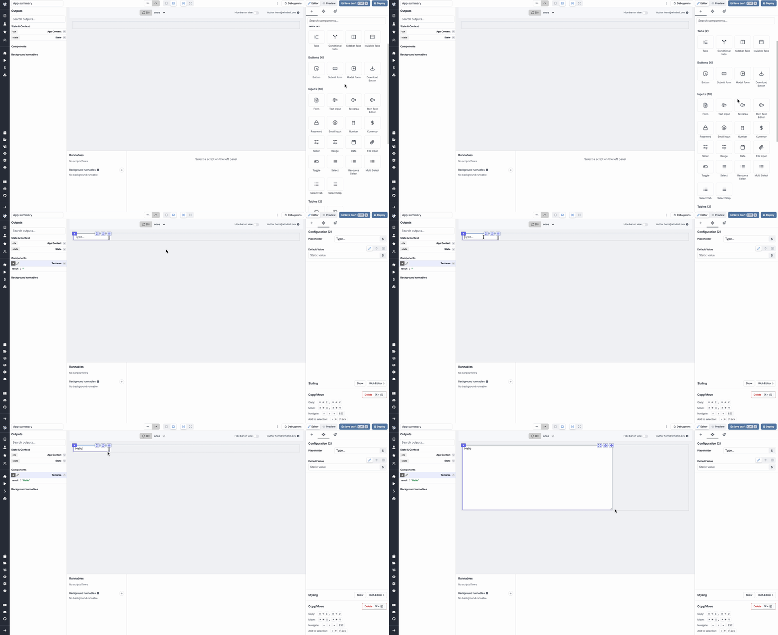
The textarea component allows you to get a string from the user, with an expandable text area.

The following section details Textarea component's specific settings. For more details on the App Editor, check the dedicated documentation or the App Editor Quickstart:
App Editor Documentation
The app editor is a low-code builder to create custom User Interfaces with a mix of drag-and-drop and code.
Apps Quickstart
Learn how to build your first app in a matter of minutes.
Textarea configuration
| Name | Type | Connectable | Templatable | Default | Description |
|---|---|---|---|---|---|
| Placeholder | string | false | false | Type... | The text input placeholder. |
| Default value | string | true | false | The default value of the text input. | |
| Disabled | boolean | false | false | Whether the text input should be disabled. |
Outputs
| Name | Type | Description |
|---|---|---|
| Result | string | The text input value. |